Roles
Duration
Tools
Sole UX/UI Designer
100 hours
Figma, Figjam, Procreate
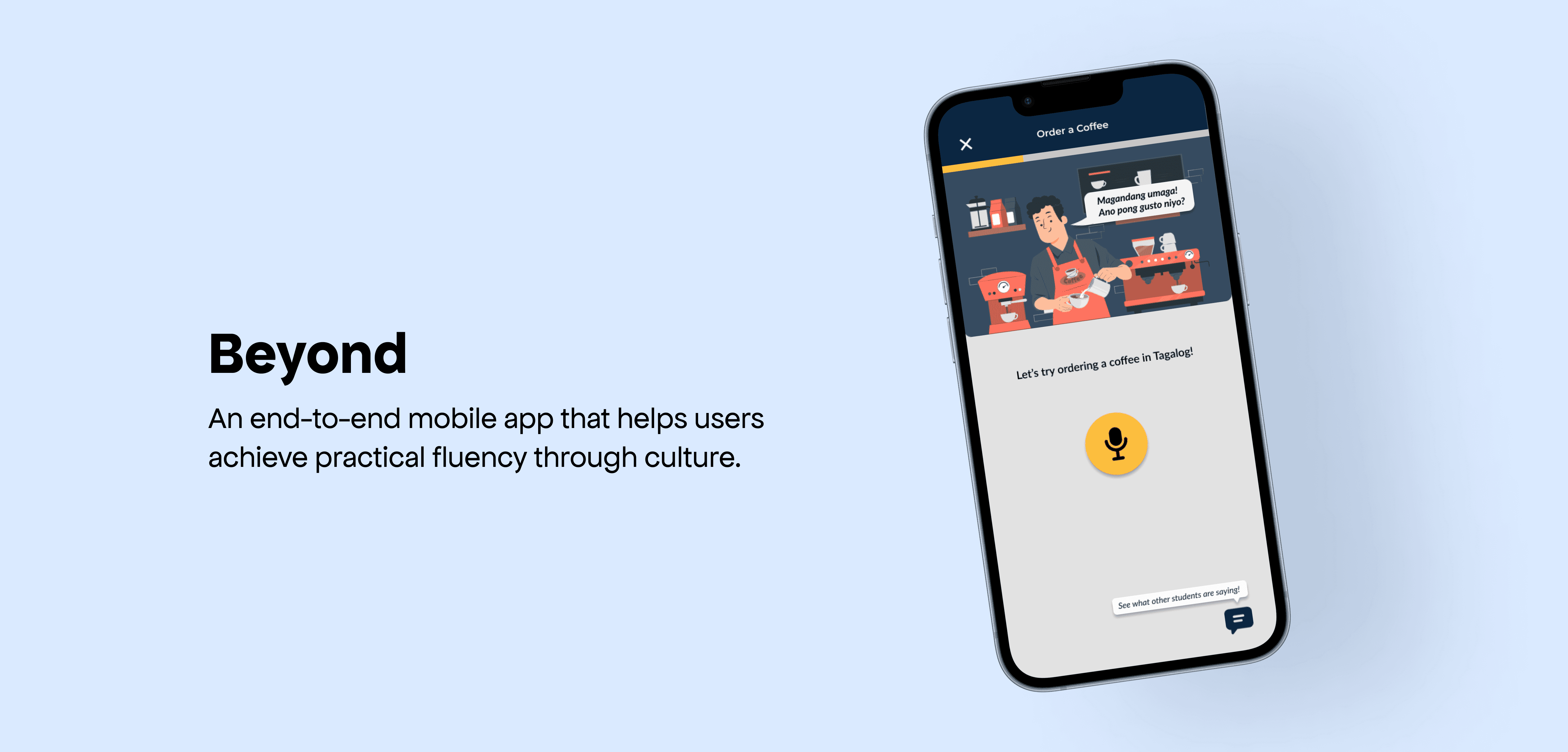
Overview
Learning a new language can feel like a solitary puzzle, often missing the vibrant culture and real conversations that make it come alive. Growing up immersed in the vibrant culture and language of the Philippines, my move to the U.S. revealed a common struggle: many in the diaspora yearn to connect with their heritage but lack the fluency to fully engage. This inspired me to create Beyond, a language learning app that blends cultural immersion, community support, and practical conversation into a meaningful learning journey.

Challenge
Seeing the Need for Real Language Engagement
Many heritage learners understand bits of their native language and culture but feel disheartened when they try to speak—often met with correction, not encouragement. Existing language apps overlook these emotional realities, focusing on isolated drills over authentic communication.
Solution
Building a Space for Connection
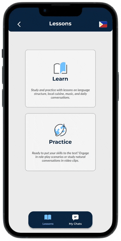
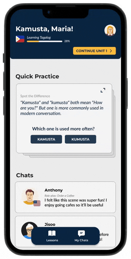
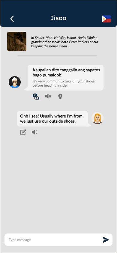
Beyond reimagines language learning as cultural connection. Through role-play dialogues, immersive videos, and peer conversations, learners build real-world speaking confidence and cultural fluency—not just vocabulary.
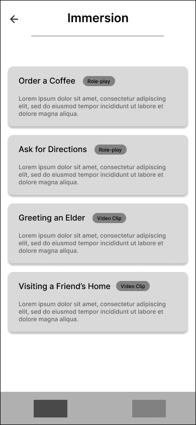
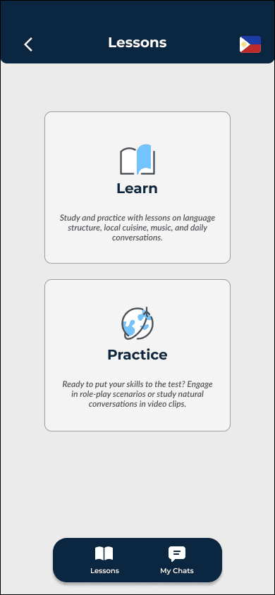
01
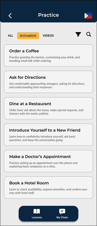
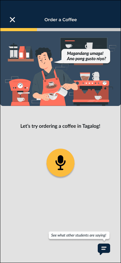
Role-Play Scenarios
Simulate real-life conversations to practice speaking in context
02
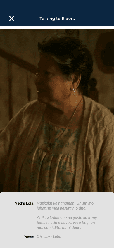
Video Clips
Watch authentic content to absorb cultural nuance and pronunciation

03
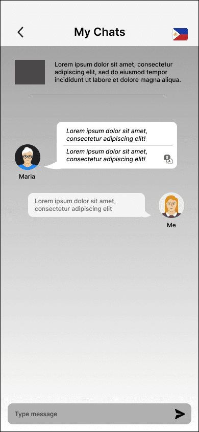
Chats
Join themed discussions with peers to practice casually and exchange insights
Research
I analyzed the existing market, distinguishing between direct competitors' other language learning applications and indirect competitors' community-based learning platforms.

Key insights:
Gamified visuals effectively attract new language learners
Strong real conversation and cultural immersion features are missing from majority of apps
Community integration is not often utilized and requires careful moderation to remain focused on learning
One of the most significant insights emerged from the analysis of Tandem. While it leverages community learning groups and chat for language exchange, it seems many users aren't really there to learn. Instead, it's increasingly seen as more of a dating platform. This really underscored for me how crucial it will be for Beyond to carefully consider how to integrate any social features, ensuring they genuinely support language learning and don't distract from our core purpose.
Interviews
Understanding the Language Learner
I conducted interviews with 9 participants, particularly those motivated by connecting with family or friends. These conversations focused on their learning experiences, frustrations with existing tools, and what they truly needed in a more engaging approach. See my full affinity map here.
Here’s what was mentioned most frequently:

Many tried learning from family members but were discouraged by criticism without any explanation or guidance. This left them feeling ashamed or hesitant to keep trying

Current language apps feel inflexible, lacking personalization and offering few opportunities for real-life conversation practice

Peer interaction, supportive communities, tutors, and native speakers were consistently cited as motivating—especially in one-on-one or small group settings
Ideate
Empathy Map
To truly grasp the challenges faced by language learners, especially those yearning to connect with their heritage like my interview participants, I created an empathy map to step outside my own experience as a fluent speaker. This allowed me to visualize their frustrations, desires, and the emotional journey of trying to learn a new language, particularly when existing tools fall short of providing authentic cultural connection and practical conversational skills.

Focused Persona
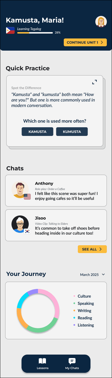
Mia helped prioritize features that build confidence in shy speakers, like private practice chats.

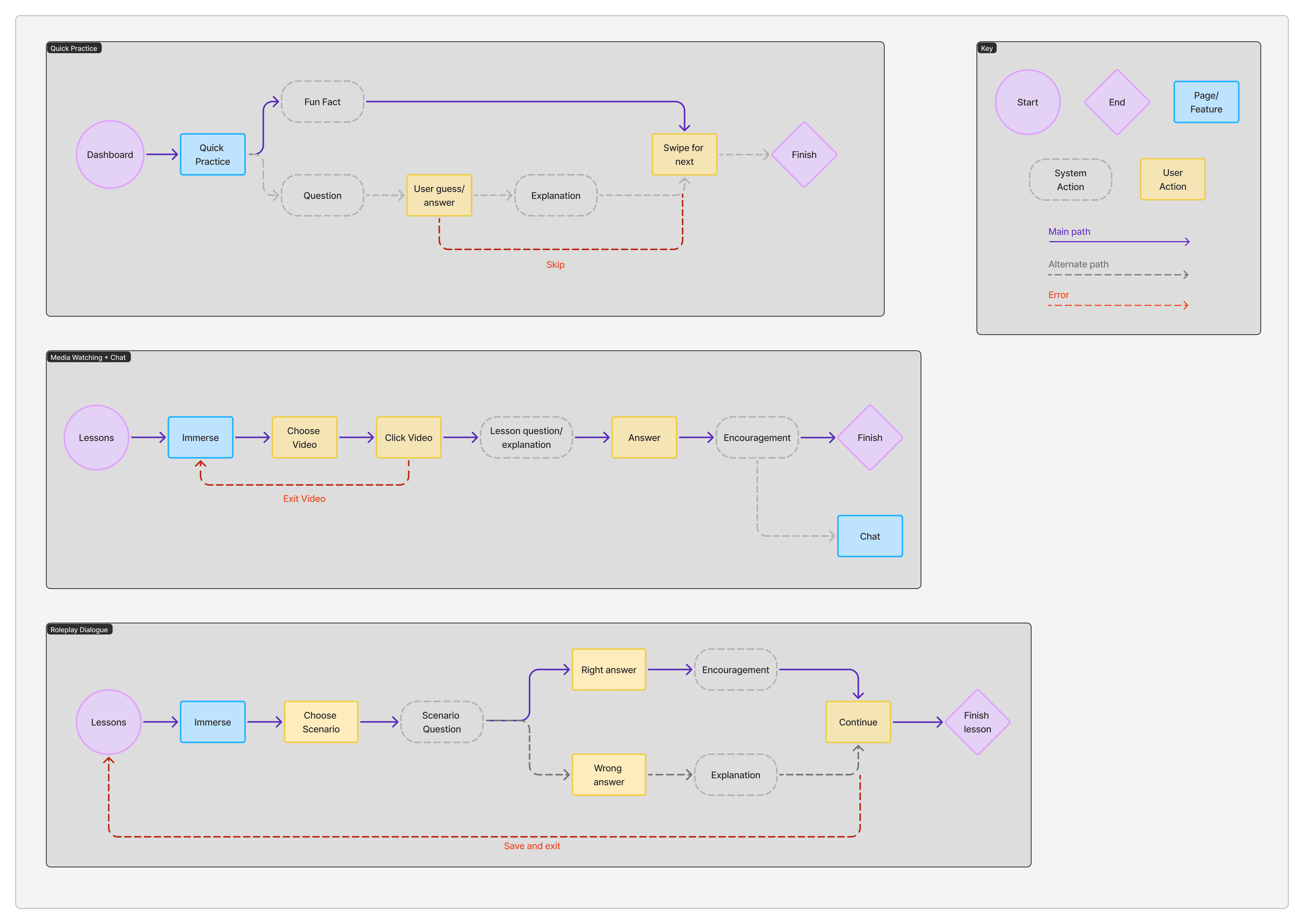
User Flows
To illustrate how learners might progress from watching a video to joining a topic chat, I've outlined key user flows centered around our core features: media watching into topic chats, role-play scenarios, and quick practice.
Design
Sketches

Dashboard
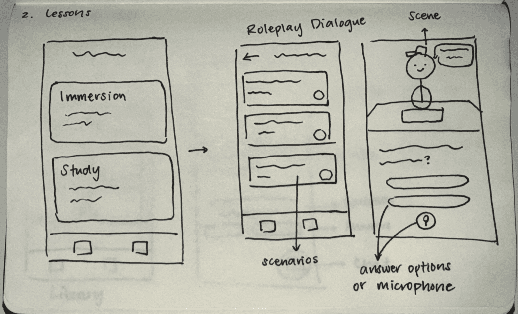
Lessons & Practice

Media Watching

Chat
Mid-Fidelity
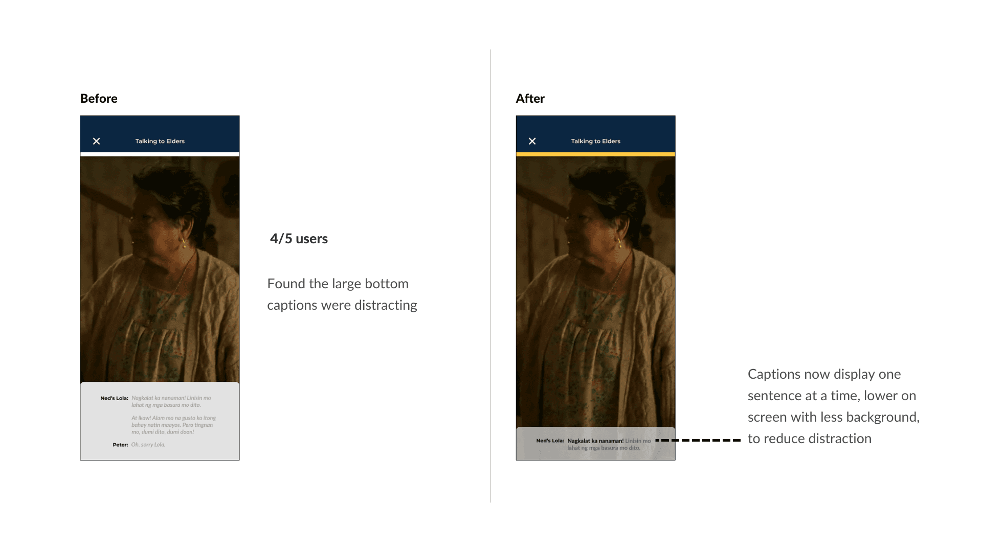
In a usability test with 5 users, the core features of Beyond were generally easy to navigate. However, accessing user topic chats presented a consistent point of confusion. All 5 participants expected the "my chat" button to open a forum with diverse topics, finding the current link to lesson-specific chats unintuitive.


Branding
Having decided on the simple yet expansive title 'Beyond,' my exploration for this project has embraced the concept of space, stars, and the boundless expanse of outer space. Inspired by 'to infinity and beyond,' the vision extends beyond traditional vocabulary acquisition and cultural exploration, aiming for a learning journey that feels limitless and truly transcends conventional boundaries.

Hi-Fidelity
Testing
I conducted the usability test with 5 users (3 returning from interviews, 2 new), aimed to evaluate the core navigation and user experience of the Beyond language learning app. Participants were tasked with finding and engaging with key features:
Starting a beginner lesson, navigating
Immersive roleplay dialogues
Finding cultural video clips
Accessing user topic chats
Utilizing the quick practice feature from the home screen
View Prototype
Results
Success! But Refinement Needed
Across 5 users, a strong majority successfully navigated the key functionalities of Beyond. While core navigation was generally successful, specific interactions and visual cues presented opportunities for improvement to align more closely with user expectations and enhance consistency.
What Worked
Most users navigated lessons easily and appreciated progress indicators to track their journey
3 of 5 users (all returning) found the colored icons helpful for orientation and faster feature discovery
Users found the video clips engaging and informative, contributing positively to immersion
Participants responded positively to the simulated conversation format, calling it “fun” and “realistic.”
What Confused Users
All 5 users misunderstood the “My Chat” button. They expected a broader forum or community landing page, not chat tied to specific lessons
Users noted inconsistency in icon usage. They expected colored icons across all sections
Some users wished for estimated completion times for lessons and practice segments to plan their learning sessions better
Iterations
Listening to User Feedback
Iteration 01:
Practice Menu

Iteration 02:
Topic Chat

Iteration 03:
Video Captions
Final Thoughts
Reflection
Reflecting on this project, I found it particularly rewarding to tackle a challenge I haven’t personally faced. One moment that stuck with me was realizing how isolating language learning can feel without cultural connection. This insight shifted my focus to designing features that foster real interaction and emotional resonance, not just vocabulary drills. Stepping outside my own experience to understand the user's perspective was a valuable, albeit challenging, process.
Talking directly with users was eye-opening, especially when one participant shared how demoralizing it felt to rely on flashcards that never translated into real conversations. Insights like this directly shaped features like the role-play dialogues and guided my decisions toward a more human-centered design.
Next steps:
Design a user-friendly "My Favorites" section for easy access to bookmarked videos and lessons
Conduct comprehensive testing with a larger, diverse group, including implemented changes, to assess overall learning flow and engagement
Other Projects
TracerGolf
Improving the onboarding experience for new and returning golfers.
Book Buddies
Read together, track progress, set goals, and share notes: your own virtual book club.
Until next time~
katrinaicruz@gmail.com ✽ LinkedIn