
Team
Client Stakeholder
Duration
Tools
Overview
TracerGolf is a Canadian company offering 24/7 automated indoor golf simulator facilities. Founded in 2019, the business operates without staff or memberships. Users book online, access via smart key, and play on premium simulators.
Ahead of launching a new mobile booking app, we redesigned the website to reduce friction, clarify the value proposition, and support adoption, with early feedback indicating a smoother booking experience.

Challenge
16% of support calls were due to simulator confusion
Users were overwhelmed by videos, GIFs, and text presented all at once. Navigation loops made it unclear where to begin.
What we learned
More instructions didn't fix the issue
We interviewed 8 users and ran a heuristic review. Most users didn’t want a full walkthrough. They just wanted to start. When everything was shown upfront, they ignored it or got stuck deciding where to look first.


Core design
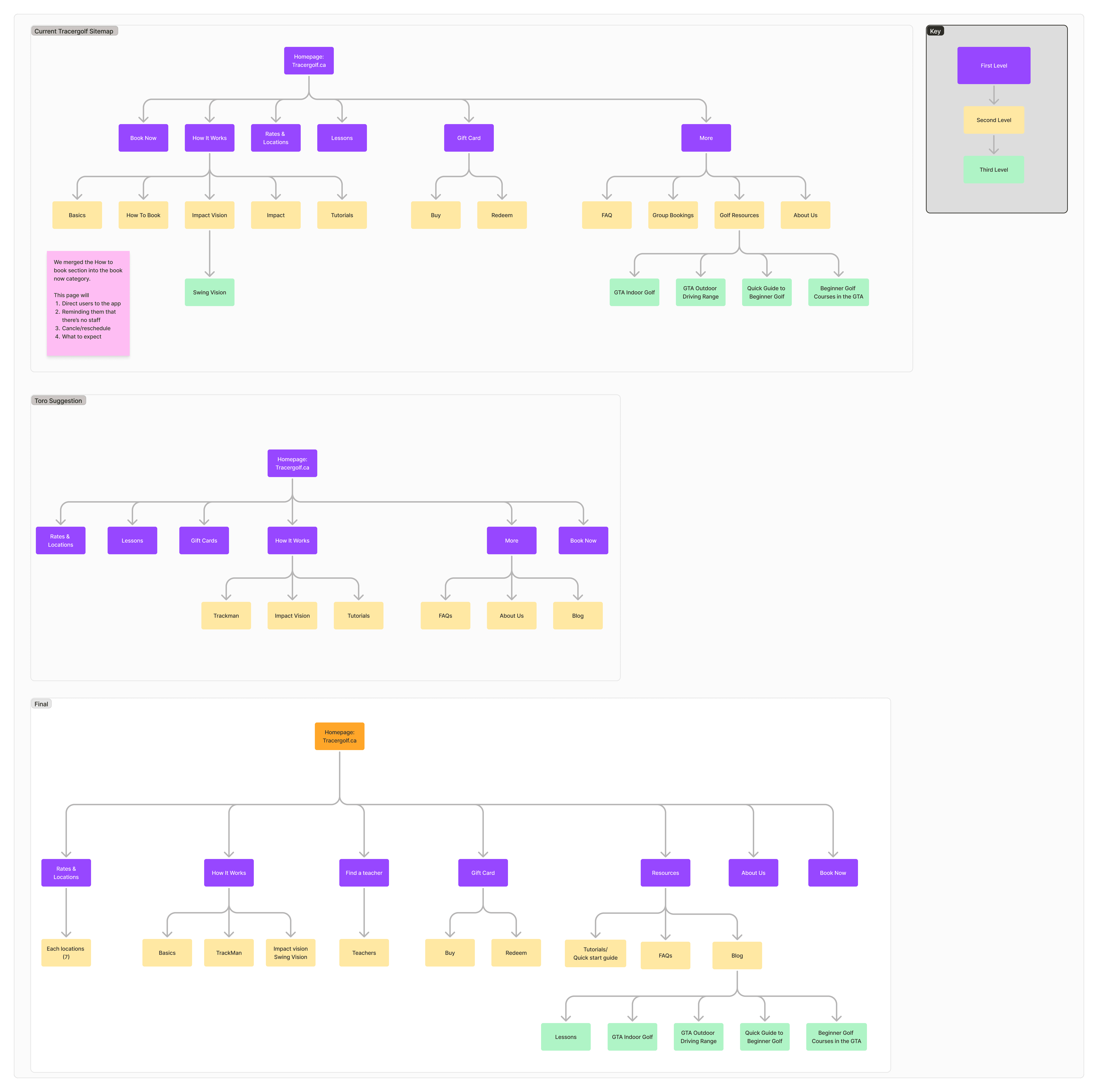
A simpler structure made the next step obvious
We conducted a sitemap audit and collaborated with Toro to define a new site structure that offered better flow and clarity.
Validation approach & iterations
Simplifying flows reduced friction across key tasks
We tested a simplified approach with 7 users across key tasks including booking, learning the system, redeeming a gift card, and booking a teacher. This confirmed that reducing upfront content improved clarity without increasing confusion.
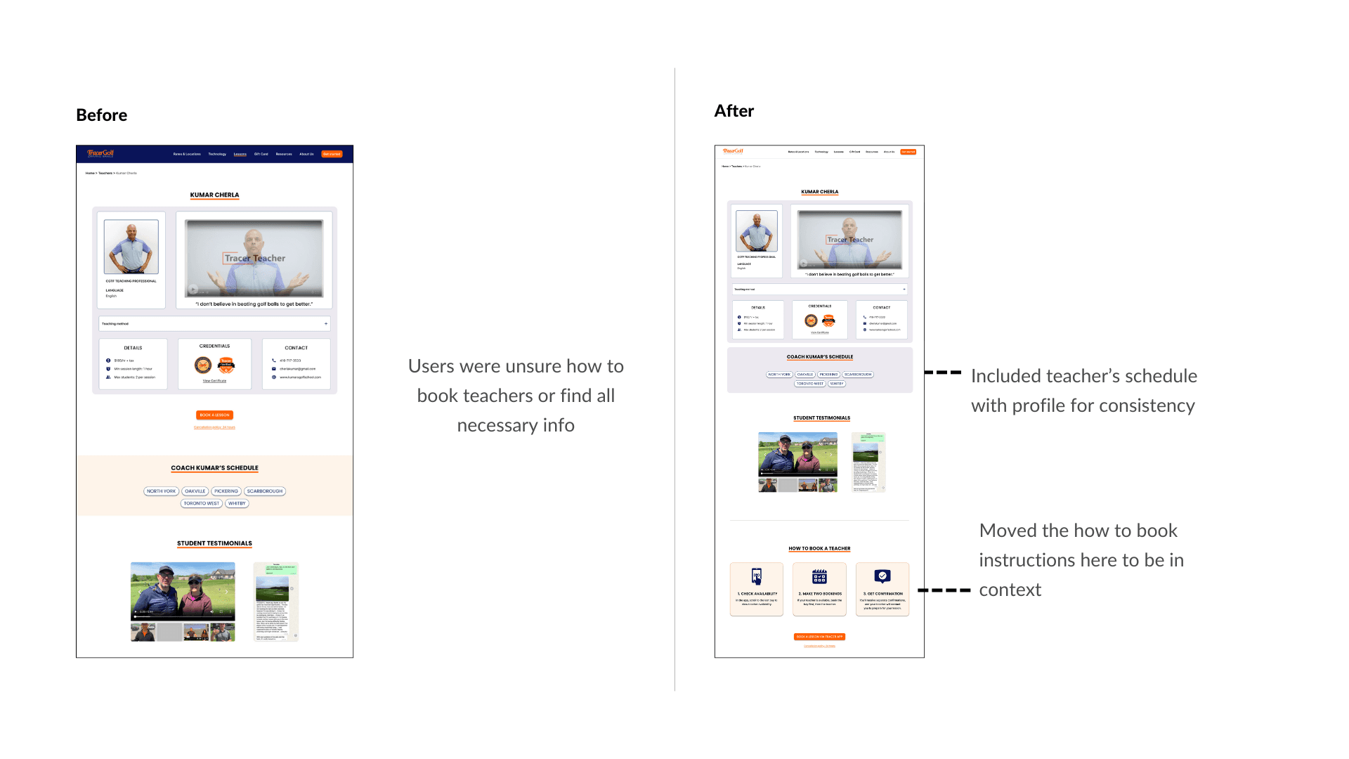
Testing revealed friction during booking, including forced app downloads, hard-to-find gift card redemption, and disconnected teacher booking. We streamlined these flows and clarified key actions.
Some constraints, like the app handoff, remained but were better defined.
Iteration 01:
Booking a Teacher
Iteration 02:
Buying or Redeeming a Gift Card

Impact
A simpler experience reduces confusion and support needs
The redesign reduces the need for users to search, guess, or rely on support. Clear entry points help users start faster. Structured content helps them move forward without hesitation. Consistent design improves trust.
Together, these changes are expected to reduce support calls tied to confusion and increase booking completion, especially for first-time users.
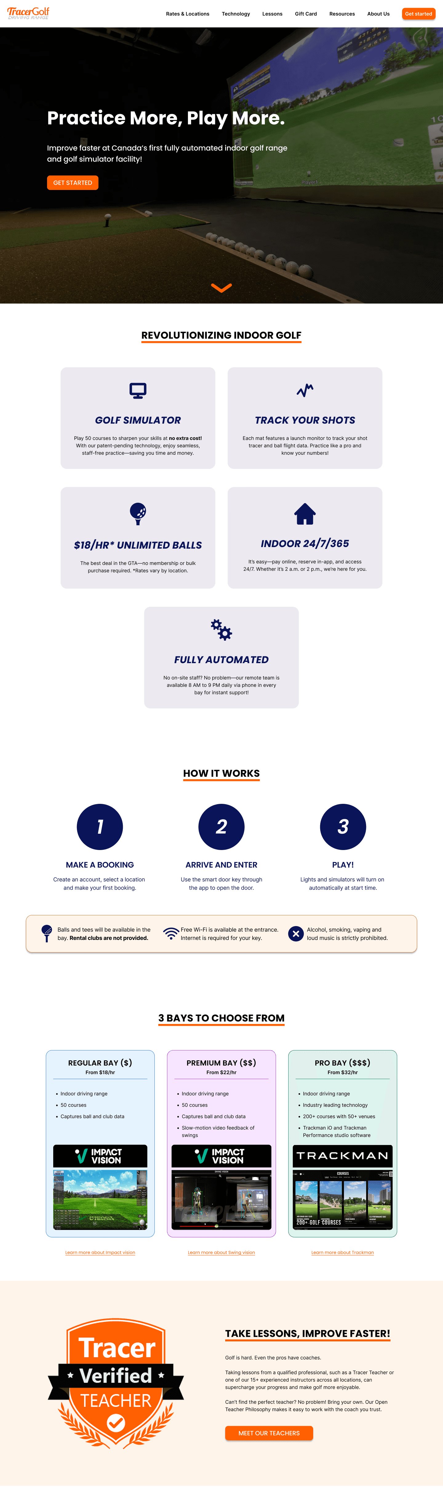
Before
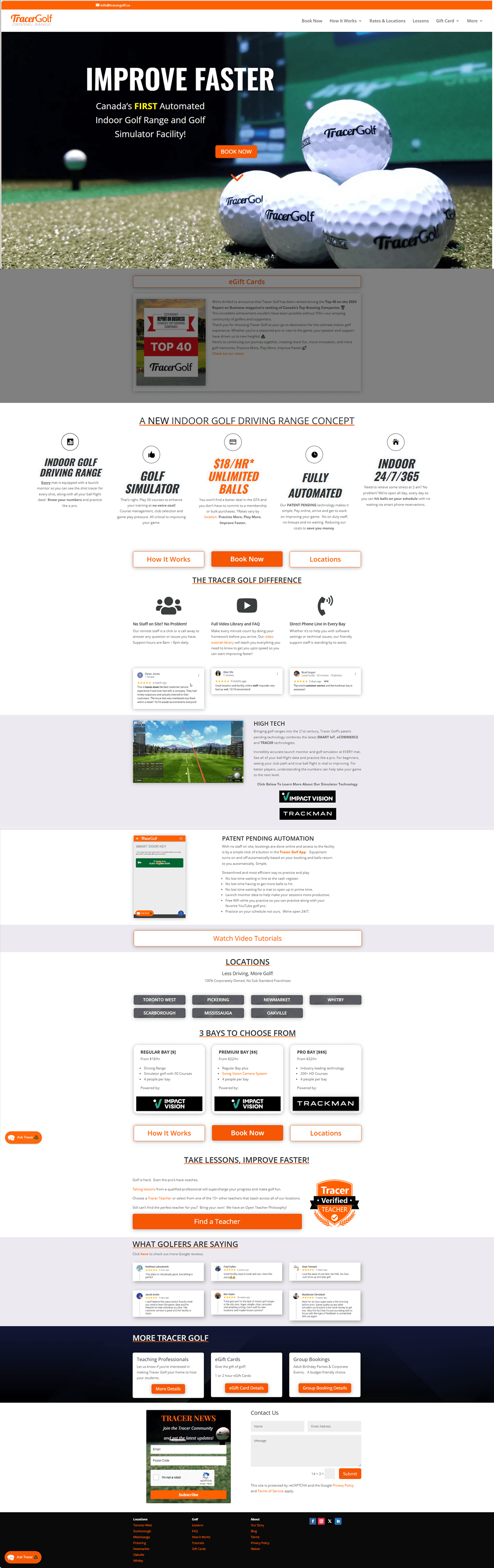
Homepage
After
Homepage
Before
Book Now
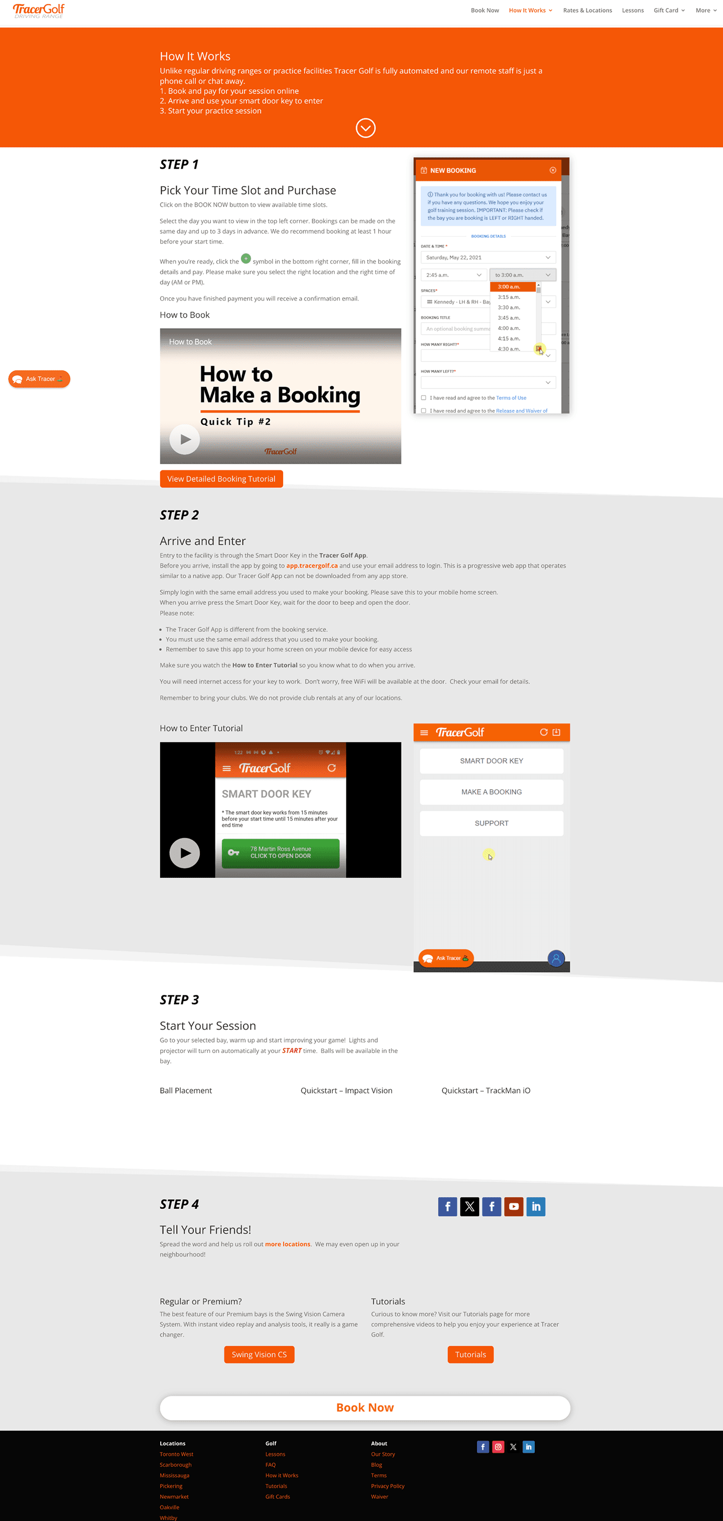
After
Book Now
Before
Book a Teacher
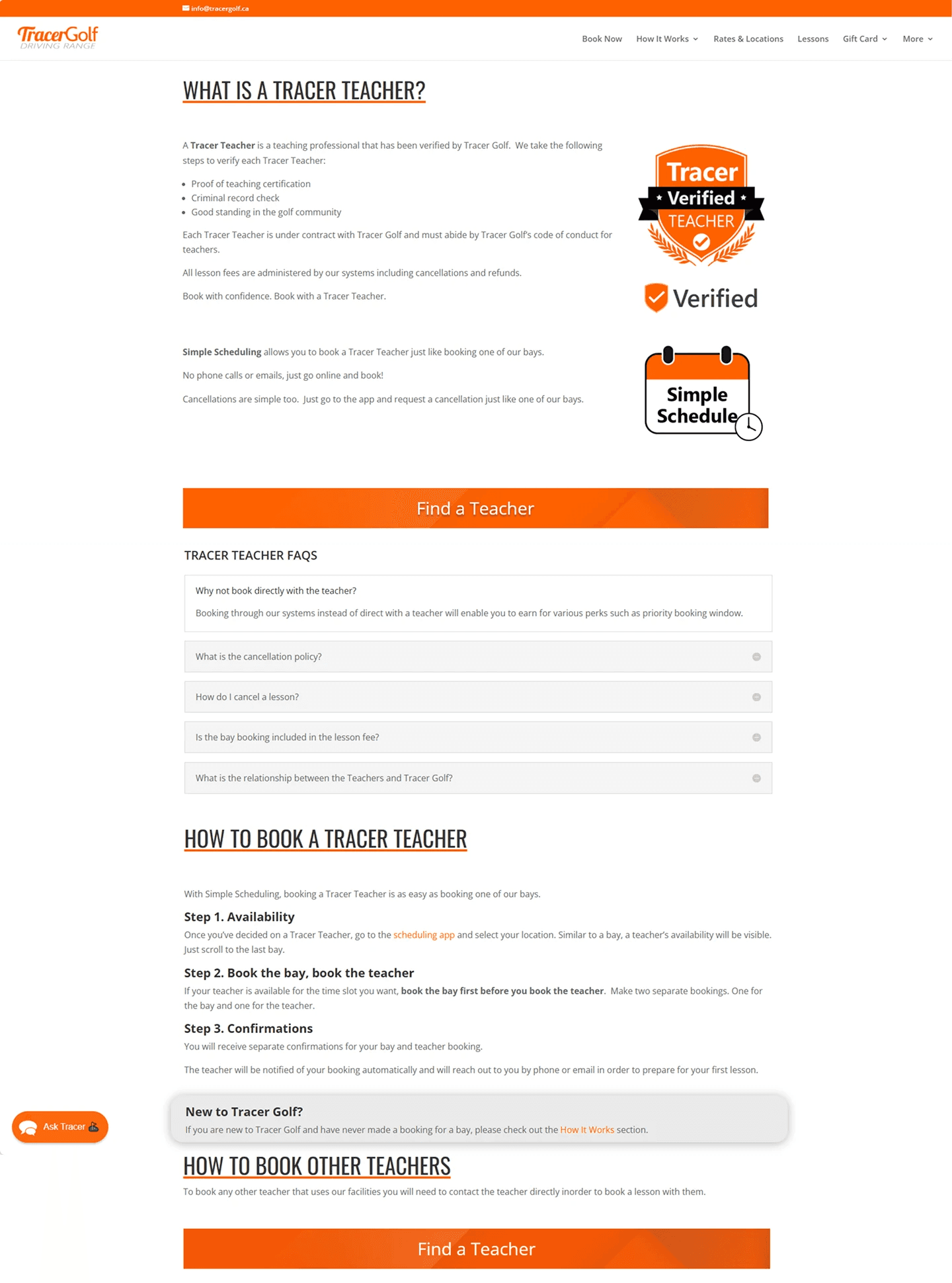
After
Book a Teacher

Reflection
This project reinforced that clarity comes from structure, not more content. Research helped challenge assumptions and support simpler solutions. I also stepped into a more proactive role, leading synthesis sessions, presenting design strategy, and breaking through blockers. Having a strong design partner made the sprint both fun and high impact!